A major visual update with four color themes, responsive layouts for mobile, and polish across the platform.
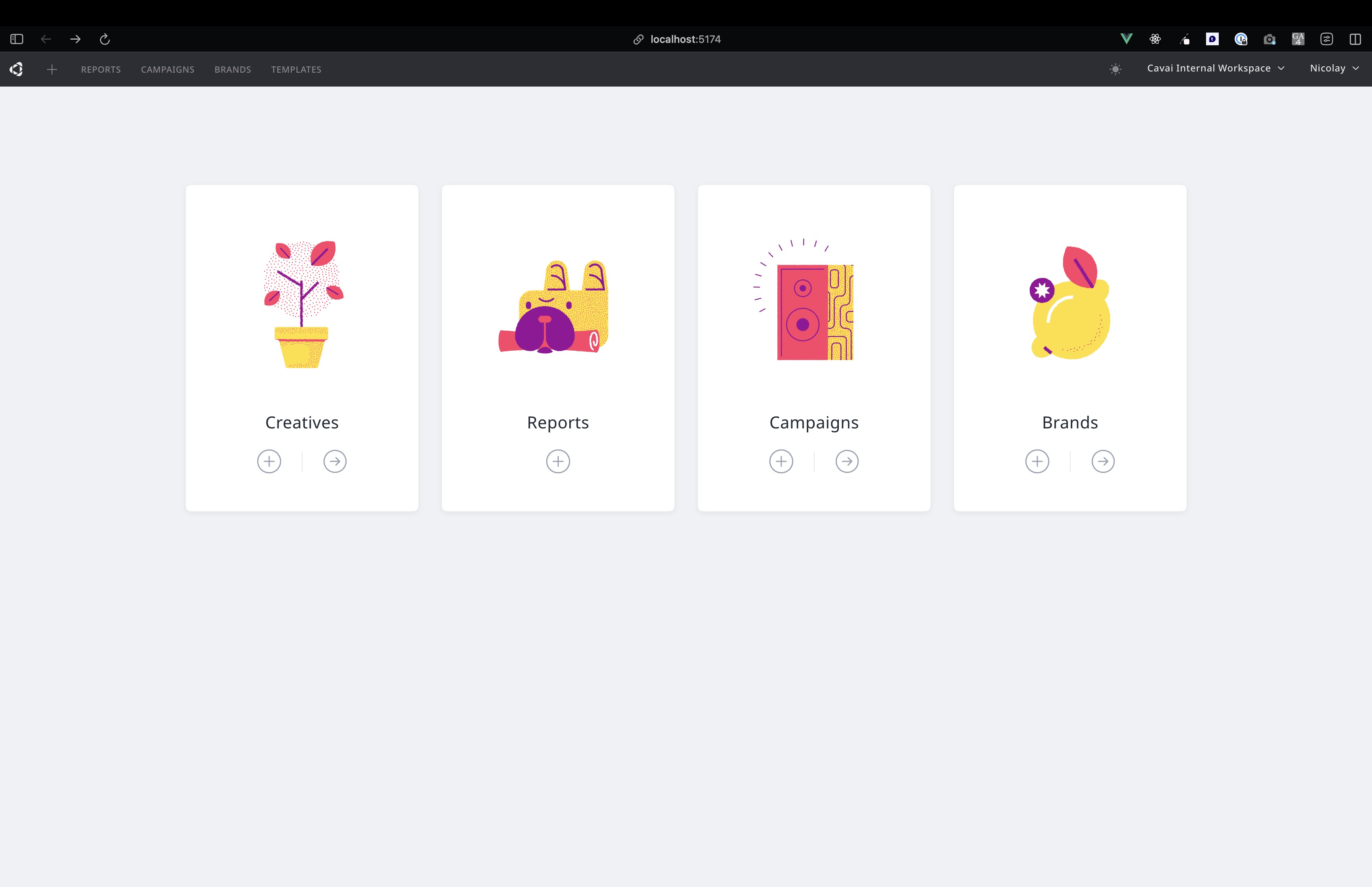
Choose from four color themes and switch instantly from the top bar:
Dark and Light use Cavai's coral accent. Nord is arctic-inspired with a frost blue accent. Mocha is warm and muted with a mauve accent. Your choice is remembered across sessions, and switching is a smooth crossfade.
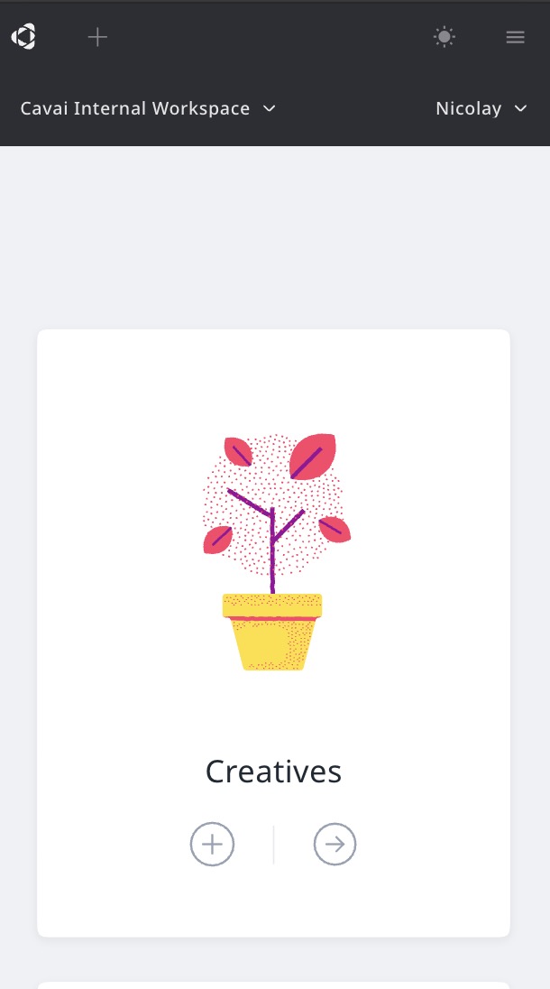
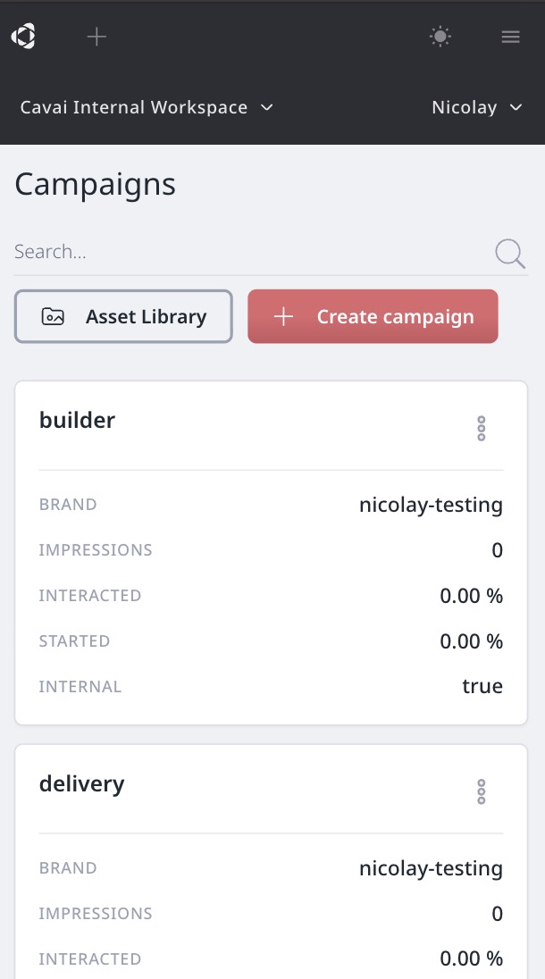
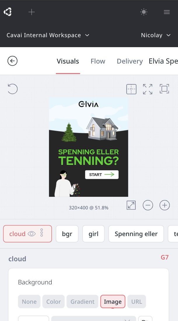
The entire platform now adapts to smaller screens. On phones, the builder stacks the preview on top with a compact block strip below, tables switch to card layouts, and a hamburger menu replaces the sidebar. Touch targets are sized for fingers throughout, and the login page fills the screen correctly on mobile browsers.
The builder has rounded card shapes, compact config headers, a cleaned-up icon set, and a resizable and collapsible config panel for more preview space. The flow editor has clearer connector lines and the operator dropdown is now organized by category, with legacy operators (Shop and Reset) removed. Account pages use a flatter layout with progressive disclosure on edit forms.


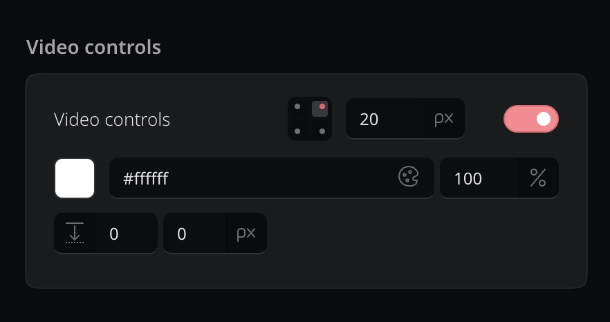
A new configuration card for video player controls with a corner grid, size input, color picker, and directional offset.
The video controls settings have been redesigned into a compact configuration card. A visual corner grid lets you place controls in any corner of the video. A toggle shows or hides the controls entirely. Size, color with opacity, and offset are all adjustable from the same card, with live preview as you drag.
A new auto size option lets buttons and form submit buttons size themselves to fit their content. Padding and text determine the dimensions, with fixed sizes and percentages still available when you need them.
The size input now cycles between px, %, and auto. In auto mode the button's width adapts to its content, so designing buttons is simpler: just set the text and padding, and the button sizes itself. Both regular buttons and form submit buttons use auto as the default.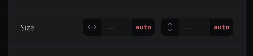
Padding has a new link toggle that switches between three modes: all sides equal, vertical and horizontal pairs, or each side individually. The mode is detected automatically from existing values. HTML blocks also get a border toggle in the Effects card, matching the other block types.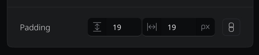
A new custom metrics builder in Reports, smarter creative wizard, plus preview and stability fixes throughout.
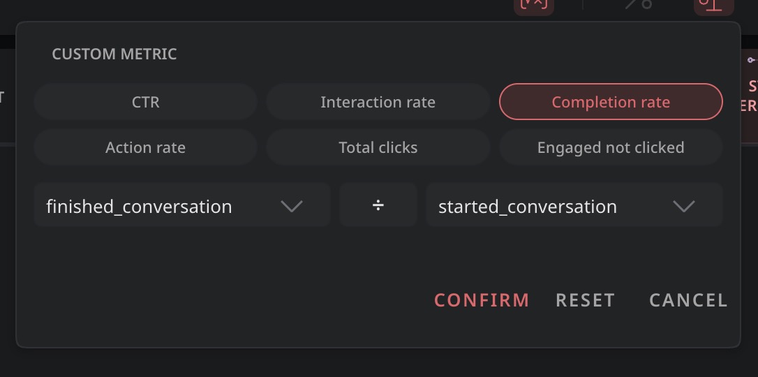
The custom metrics builder in Reports has been replaced with a structured interface. Pick two metrics and an operator from dropdowns, or choose from six preset chips: CTR, Interaction rate, Completion rate, Action rate, Total clicks, and Engaged not clicked. This replaces the previous free-text formula input.
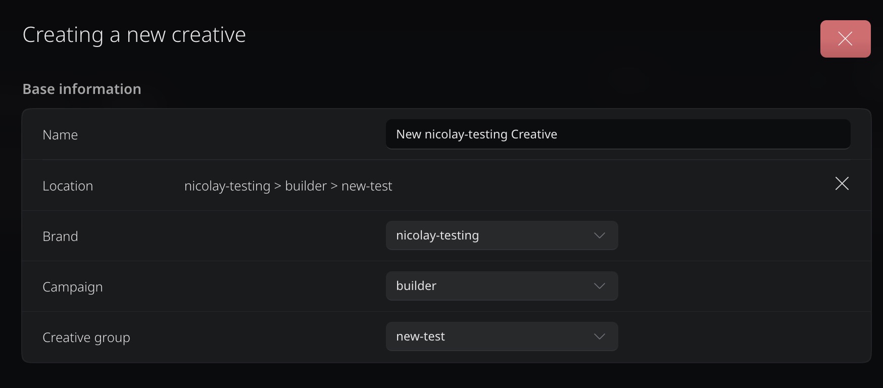
Creating a new creative now pre-fills the Brand, Campaign, and Creative group fields based on where you are in the platform. The location breadcrumb updates as you change them, so you always know where the creative will end up.
Navigating away from the Visuals tab and back now preserves your selected size preset. The mobile options bar has been fixed and its inputs now support drag-to-adjust. Enterprise workspaces get additional size presets for onsite creatives.
Also fixed: the breadcrumb now shows correctly for empty creative groups, presentation mode no longer overlaps other elements, and several smaller visual issues in the builder have been cleaned up.